ROPID, the regional regulator of integrated communications in Prague, has concluded an international competition for a visual information system – coherent for public transport and urban space. The Czech team consisting of Side2, A69 and Superior Type won. The new tags will be tested during the summer holidays.
Sixteen teams participated in the competition, half of them from the Czech Republic. The proposal of the team consisting of Side2 Graphics Studio, Studio A69, Architectural Design Studio and Excellent Type Printing won. – The winning proposal was chosen unanimously, and there was clear unanimity. The project is very complex, detailed and well thought out. It was clear that the winning team put in a lot of time and effort. At the same time, the design, with all its elements, is simple in the positive sense of the word. The proposals make a very good impression, they do not compete with the city, but perfectly fit into the space. Other aspects such as graphics, colors, and all manner of typography seem thought out. The composition contains the appropriate level of mapping detail, explains Mike Rawlinson, chair of the commission.
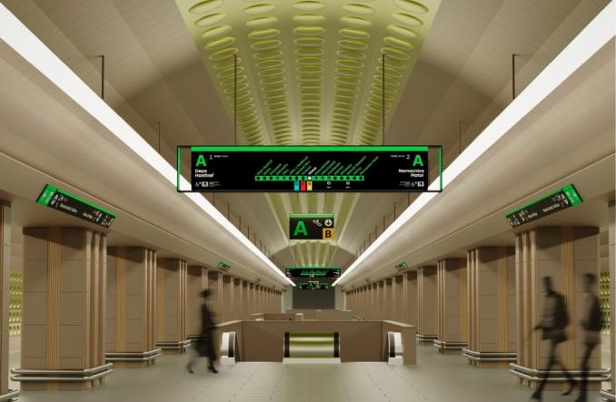
I would like everyone to find information about their trip easily and not get lost unnecessarily. And this is what happens now, for example, when searching for the right exit from the subway, changes at complex intersections or getting around the city. Prague residents can anticipate the elements of modern signage using modern digital information carriers. Transparency, good clarity and presenting updated information are essential. The more travel modes we offer, the clearer the information should be. In terms of quality and design, Prague will finally be compared to world capitals such as New York or London,” says Adam Scheinherr, Prague Deputy Mayor for Transport. He adds that the implementation of the new signs is particularly important in the context of the construction of a new metro line D, which will force the modernization of many information carriers.
The pilot for the new system will begin this summer. New screens will appear, among others, at the bus stops of Prosek, Ládví and Budějovicka. New icons will appear at the Holešovice train station and at the Háje and Palmovka metro stations to indicate the entrance to the metro. The Staroměstské náměstí – Výstaviště pedestrian route will also be marked. The city should be clear to its residents and visitors. Good orientation in public transportation undoubtedly facilitates the movement and life of people in the city. We will allow travelers to evaluate the new system and only after collecting their opinions will we develop final solutions that we will start implementing from 2023. The changes will be gradual and natural – we do not intend to replace all carriers at once – confirms Zdenek Heube, Mayor.
As Prague emphasizes, the design chosen refers to the famous marking system that is the responsibility of graphic designers Rostislav Vanek and Jiří Rathouský. It was implemented in the 1970s and 1980s in the Prague metro, but has not been developed since then. His element was the Metron typeface. Most of the elements disappeared as a result of the station’s renovation after the devastating 2002 floods.

“Music specialist. Pop culture trailblazer. Problem solver. Internet advocate.”


